
paws
Pet adoption platform. Connecting pets with loving homes, easily and effectively.
Project type: End-to-end app + branding.
Role: Sole UX/UI designer + brand designer
Industry: animal welfare and care
paws
Pet adoption platform. Connecting pets with loving homes, easily and effectively.
Project type: End-to-end app + branding.
Role: Sole UX/UI designer + brand designer
Industry: animal welfare and care
Jump to section
Project overview
Paws is a user-centered mobile application designed to streamline the pet adoption process. Born from the desire to make finding a furry companion easier and more accessible, paws connects animal shelters with potential adopters through a seamless, intuitive, and heartwarming digital experience. With smart search tools and detailed pet profiles, paws helps pets find loving homes.
The problem
Every year, thousands of pets end up in shelters, waiting for someone to give them a second chance. The intention to adopt is there, but the process? Not so friendly. Adoption websites can be confusing, outdated, or just overwhelming. It’s hard to know where to start, how to trust the info, or if that cute little face you just saw is still even available. On the other side, shelters are doing their best with limited tools to showcase the amazing animals in their care. It’s a bit of a mess, and animals are the ones stuck in the middle.
The goal
✔ Create a smooth, intuitive, and warm adoption experience.
✔ Help adopters find the right pet faster and easier.
✔ Support shelters with tools to manage animals and connect with potential adopters.
✔ Reduce friction = more pets in happy homes.
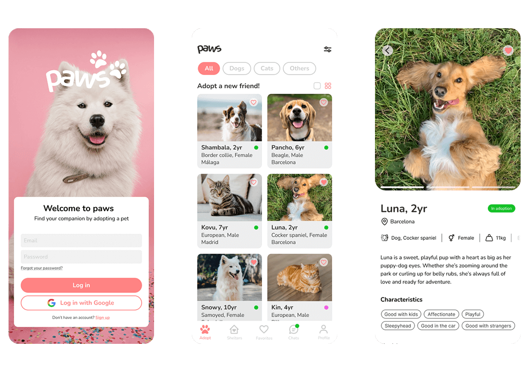
The solution: paws
A mobile-first platform that brings empathy to adoption.
For Adopters:
Smart filters (age, breed, size, location).
Rich profiles with stories, photos, and fun facts.
Simple and clear interface.
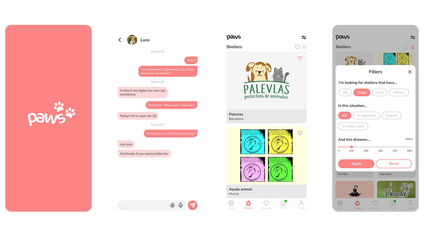
For Shelters:
Easy-to-use dashboard for pet management.
Notifications and inquiry tracking.
Faster, smoother communication with adopters.
Paws is designed to make the process feel as good as the outcome. Because adopting a pet should start with joy, not frustration.

User research
Research goals
Before jumping into design, I wanted to understand:
What do people struggle with when adopting a pet?
What kind of experience are shelters having?
What features could really make a difference?
So I decided to conduct a Competitor analysis and some interviews.
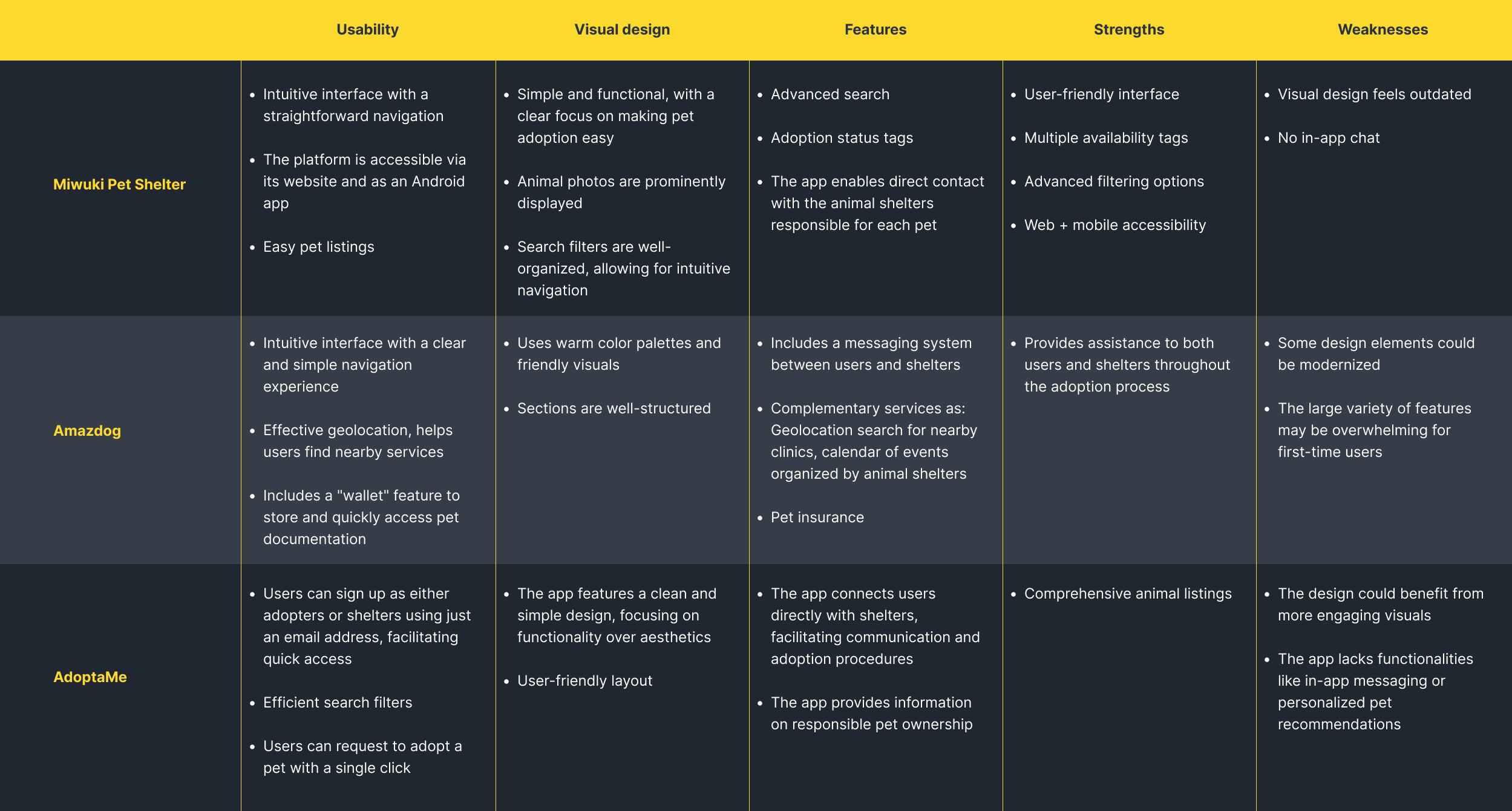
Competitor analysis
I wanted to understand the current landscape of pet adoption apps. What are others doing well? Where are users getting stuck? And where could paws do better?
So I looked into several platforms and I focused on things like:
User flow and ease of navigation
Visual design and emotional appeal
Quality of pet profiles and filters
Communication and application process
Each of these apps promote pet adoption, but they differ in focus, complexity, and user experience.
Interviewing adopters and shelter staff
I wanted to hear real stories. So, I conducted several interviews via phone or in person with adopters, first-timers and experienced ones to learn about:
How people actually find and choose a pet
What emotions they go through during the process
Where they hit blockers or friction
What I learned:
Communication breakdown is a major source of stress.
People want to feel guided, not lost in a sea of cute faces.
Adopters need user-friendly tools.
User empathy
The competitive analysis and user interviews gave me a better understanding of who the users were and how they might use an adopting app. I focused on expanding those findings into concrete visualizations that would help me empathize with users and define the product.
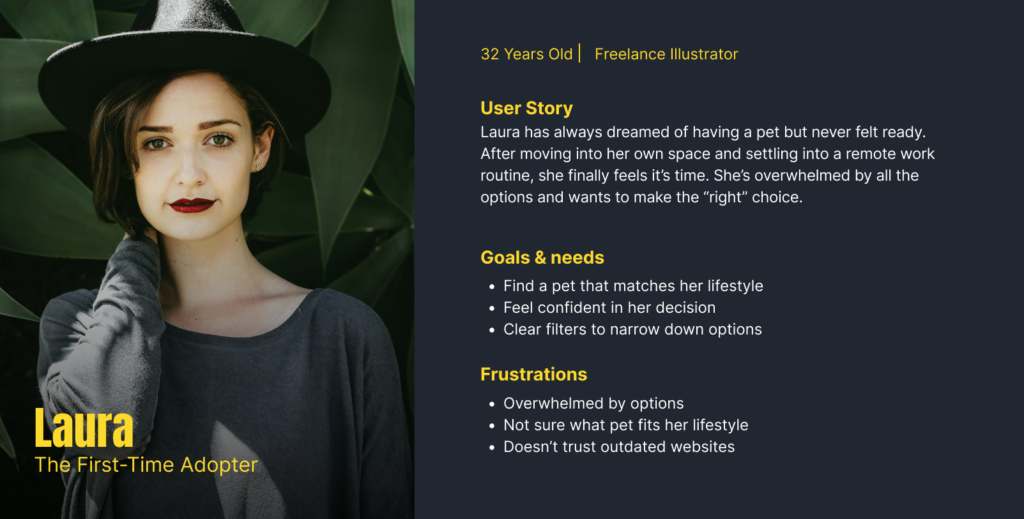
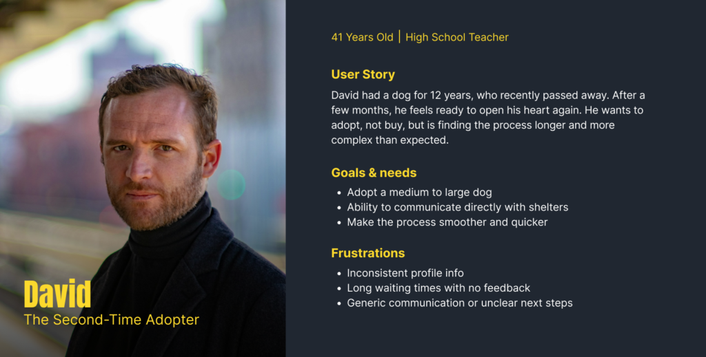
Persona development
Based on patterns from my user insights I developed two personas: a first-timer and a second-timer adopter. Since the goal of the project was to make adopting more accessible to everyone, it was important for the features to be intuitive for beginners. As such, the first-time adopter was the primary persona I focused on for the rest of the project’s development.
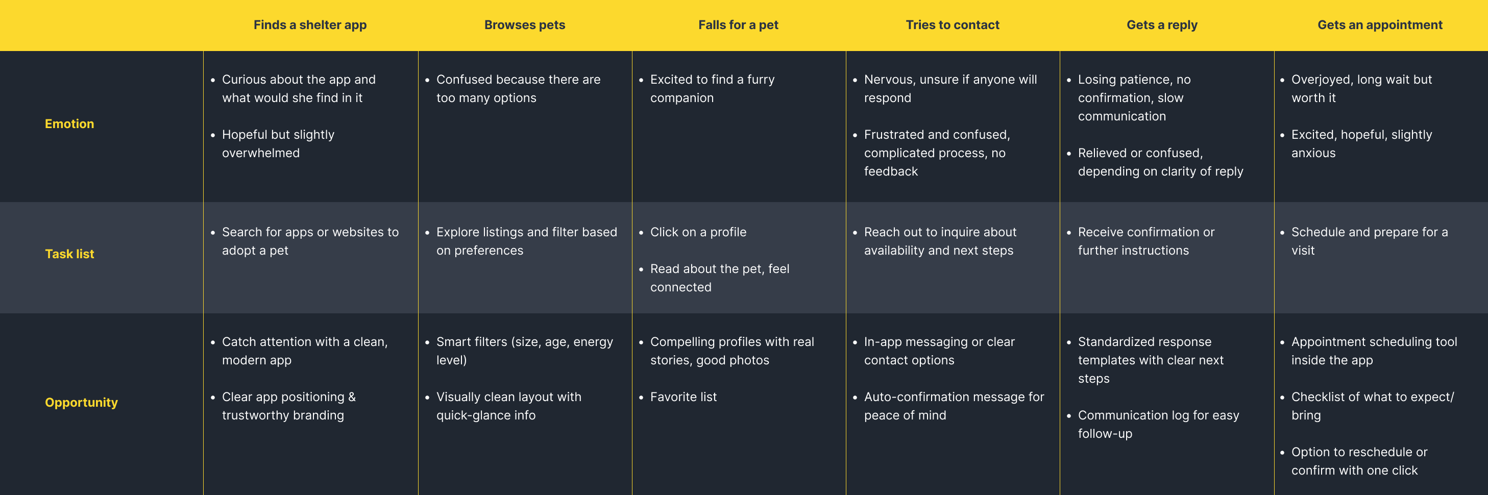
User Journey map
Understanding the pet adoption journey means going beyond features and diving into feelings. The user journey map helped me visualize the emotional highs and lows adopters experience, from discovering the app to finally meeting their potential new pet.
By mapping each step, I identified key friction points and found opportunities to create a more supportive, transparent, and joyful experience.
Desing process
With a better understanding of the users and priority app features, I began designing how those features would be realized. My goal was to create a clean, friendly, and modern interface that feels approachable and trustworthy. Paws would focus on:
Use of smart filters to easily found the best companion for you
Detailed and clean profiles, with well structured information
Favorite list so you can see it later
- Add in-app chat for better communication between adopters and shelters
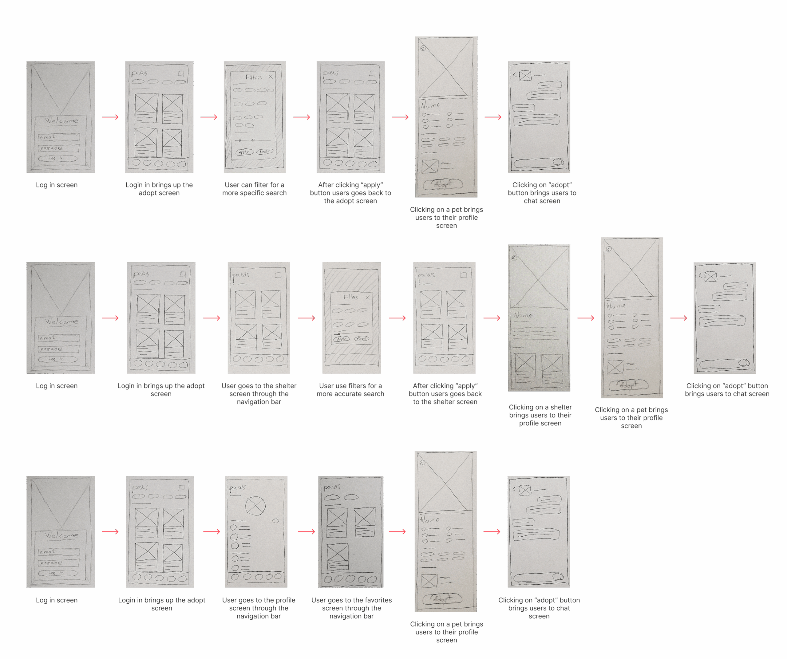
From wireframes to high-fidelity
I started with low-fidelity wireframes to define structure and user flow without getting lost in the details. Once the layouts felt solid, I moved into high-fidelity designs, applying visual styles and refining each screen with real content and interactions in mind.
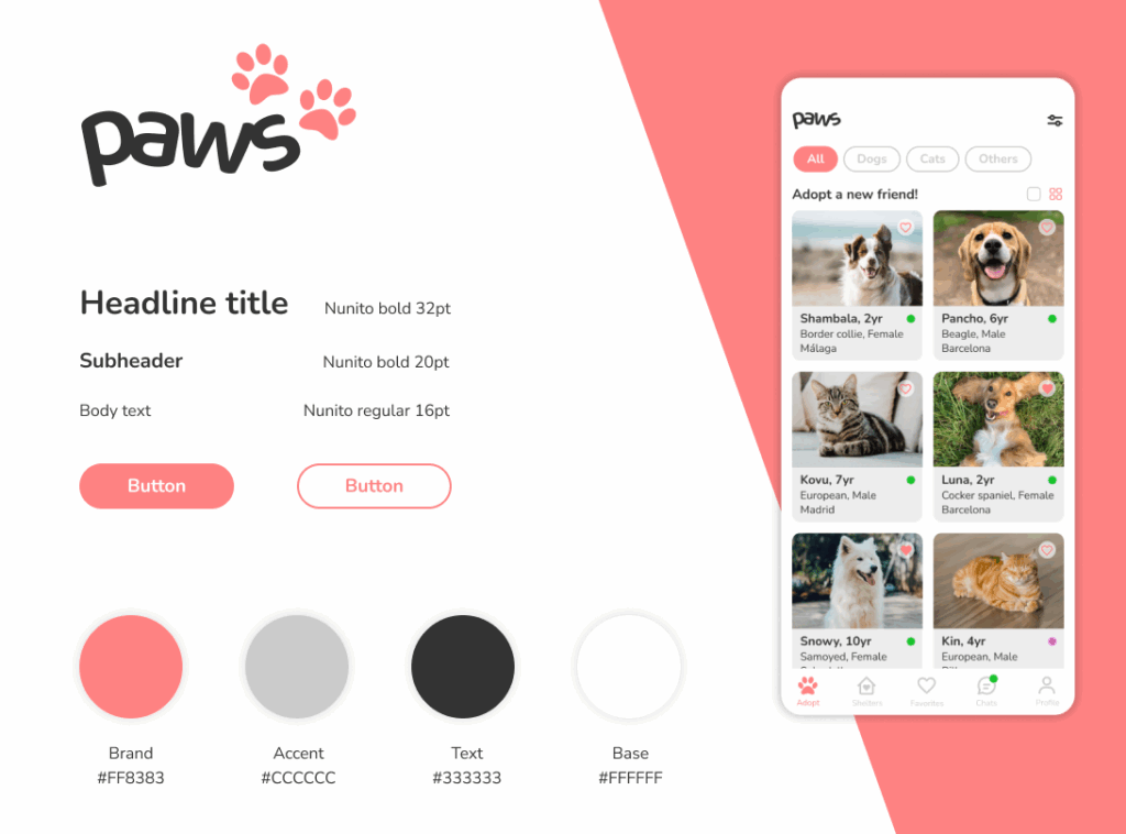
Visual language
I opted for a minimalist, flat design style, with soft coral as the primary brand color to bring energy and warmth to the interface. Rounded shapes, and clean spacing contribute to a friendly, approachable vibe that feels both modern and comforting.
The color palette is clean and intentional:
Coral (#FF8383) for calls to action and highlights
Light grey (#CCCCCC) as a soft accent
Dark grey (#333333) for high readability
White (#FFFFFF) to maintain clarity and visual calm
Typography is set in Nunito, a friendly rounded sans-serif typeface that reinforces the approachable tone of the app. With bold headlines and highly legible body text, the type system supports clarity and emotional warmth across screens.
Components & UI patterns
I designed a consistent and reusable UI system that supports intuitive interaction while keeping the interface visually light and joyful.
Key components include:
Pet cards featuring large photo previews, breed, age, location, and quick indicators, making browsing fast and emotionally engaging.
Filter chips and category tabs (Dogs, Cats, Others) allow users to quickly tailor their search.
Call-to-action buttons are clearly distinguishable in solid coral or outlined style, with rounded edges and comfortable tap targets for mobile use.
Iconography is line-based, friendly, and consistent in stroke width, supporting actions like favoriting, messaging, and filtering without overwhelming the UI.
Status dots on each pet card show adoption availability in real time, helping manage expectations and bring clarity to the process.
The result is a component system that balances emotional tone with usability, making each interaction feel simple, friendly, and purposeful.
Designing the logo
The paws logo was designed to feel playful, warm, and full of character, just like the pets it represents. It combines a rounded, hand-drawn style wordmark with two paw prints. This subtle integration of iconography adds personality without compromising legibility.
The typography is soft and friendly, with curved edges that evoke a sense of safety and approachability, core values for an adoption app. The boldness of the letters makes it stand out at any size, while the informal style keeps the tone relaxed and non-intimidating.
The coral color used in the paws adds warmth and emotional energy, making the brand feel welcoming from the first glance.
In short, the logo visually communicates what paws is all about: trust, joy, and connection.
Polish through feedback
Throughout the design process, I made small refinements based on feedback, adjusting contrast, reworking button hierarchy, and softening elements that felt too “clinical.” The result is a UI that’s not just pretty, but purposeful.
User test & iterate
To validate the usability and overall experience of paws, I conducted moderated user testing sessions with potential adopters. The goal was to identify friction points, uncover any usability issues, and gather general impressions on the look & feel of the app.
Users tested a clickable prototype and were asked to complete common tasks such as browsing pets, favoriting animals, and navigating to their profile. Overall, feedback was positive, users described the app as clear, easy to navigate, and friendly.
However, some thoughtful suggestions came up:
Users wanted to add a short bio or description to their profile so shelters could better understand them as potential adopters.
Shelters with transparent PNG logos didn’t stand out well against the app’s white background—making them harder to distinguish.
A few users noted that some font sizes felt slightly small, especially on secondary screens.
Revisions
After gathering feedback, I revisited the design to address these valuable insights:
I added a Description field in the profile screen so adopters can briefly introduce themselves and share their motivation to adopt.
I implemented a subtle background tint behind shelter logos (like a soft grey badge) to make transparent images more visible and consistent across the UI.
Typography was revised to ensure better hierarchy and readability, especially in list views and smaller UI elements.
These updates helped polish the app’s usability and align it more closely with real user expectations, keeping the experience human, clear, and adoption-focused.
What’s next?
While paws already provides a smooth and empathetic adoption experience, there are plenty of opportunities to take it even further in future iterations.
Here are a few ideas I’d love to explore:
In-app Adoption Process:
Streamlining the adoption journey by allowing users to complete the full process directly within the app, from application to approval, could reduce delays and improve communication with shelters.Partnerships with Veterinary Clinics:
Adding a section where new adopters can find nearby vets, book initial check-ups, or access basic care advice would help them feel supported beyond adoption day.Starter Kit Recommendations:
Integrating a “what you’ll need” checklist or personalized product suggestions could make the transition easier for both adopters and their pets.
As the platform evolves, the goal is to continue removing friction and offering support at every step, making pet adoption simpler, kinder, and more human.
Results and learnings
Working on paws was more than just designing a cute app, it was about building something meaningful that could genuinely help people and animals connect.
What went well
The app received great feedback for its simplicity, warm visual style, and intuitive navigation.
User testing helped confirm that the core flows (browsing, favoriting, contacting shelters) were clear and smooth.
The visual identity and UI components created a cohesive, approachable experience that users felt comfortable with right away.
What I learned
Small details, like adding a user description or improving image contrast, can make a big difference in how trustworthy and human the app feels.
Testing early and often is key: even low-fidelity prototypes helped validate big decisions before investing time in high-fidelity designs.
Balancing aesthetic with usability is an ongoing challenge, especially when designing something emotional like pet adoption. But it’s also where design can shine.
This project was a chance to apply both UX thinking and visual creativity to solve a real-world problem.