
Carhart Heritage Farms
Website for a small farm that produce and all natural organic soy candles.
Project type: End-to-end responsive website + branding.
Role: Sole UX/UI designer + brand designer
Industry: E-commerce, candles
Jump to section
Project overview
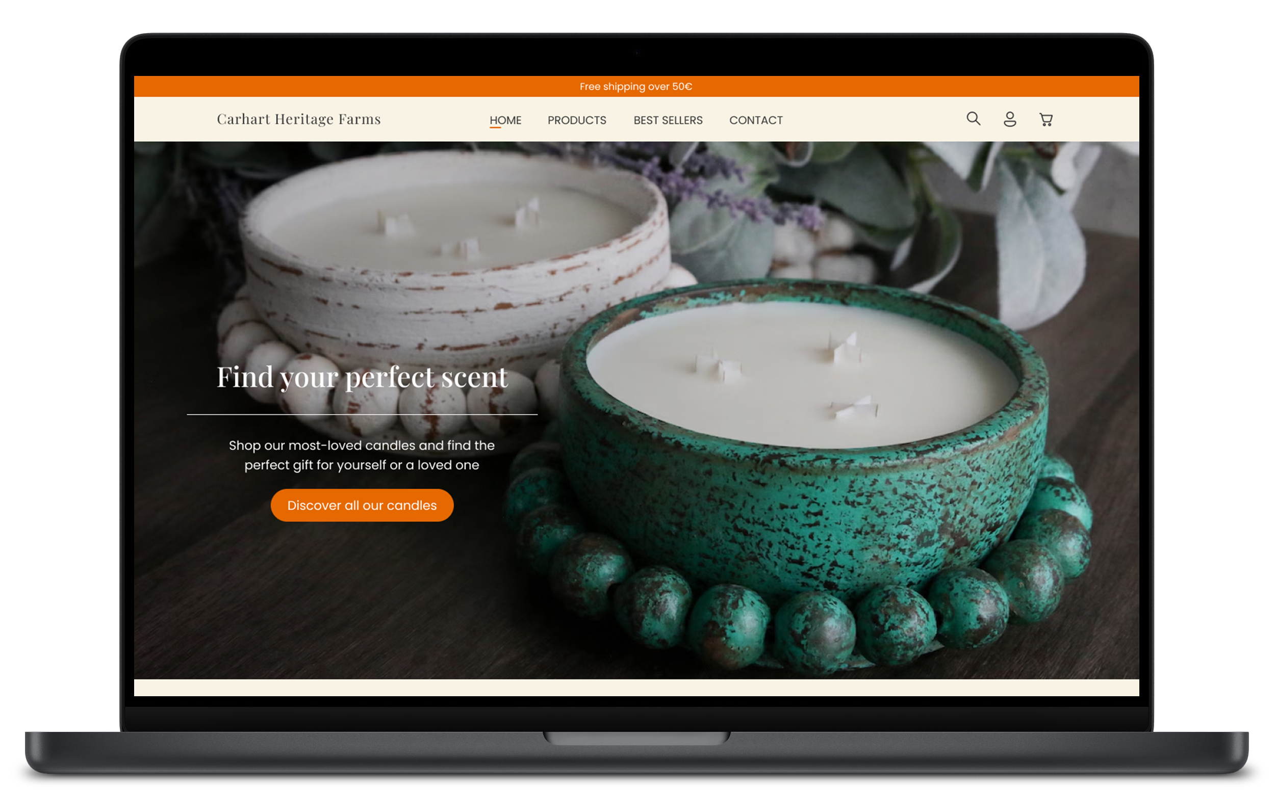
Carhart Heritage Farms is a family-run business crafting natural, hand-poured candles in small batches. Known for their artisanal approach and charming scent collections, they needed a dedicated e-commerce platform to better tell their story and reach a broader audience beyond Etsy.
I designed a warm, minimal, and product-forward website that blends brand storytelling with modern e-commerce features, placing their candles at the heart of the experience.
The brand
Rooted in tradition and made with care, Carhart Heritage Farms candles are more than just fragrant objects, they’re vessels of memory, warmth, and celebration. Each candle is crafted with natural soy wax, lead-free wicks, and high-quality fragrance oils.
The design direction embraces the organic, small-batch spirit of the brand while maintaining a professional and trustworthy e-commerce aesthetic. Earthy and nature-inspired tones were chosen not only to reflect the handmade essence of the products but also as a nod to the brand’s roots in Colorado’s natural landscapes, where rugged beauty and organic living go hand in hand.
Earth-toned backgrounds, warm lighting, and elegant serif typography support a calm, artisanal vibe throughout the website.
The challenge
Carhart Heritage Farms needed a website that could translate their in-person charm and product quality into a compelling digital experience. As a small, handmade candle business competing in a saturated market, it was crucial to:
Differentiate the brand visually while maintaining a sense of trust and familiarity.
Highlight the artisanal nature of the products and evoke a warm, emotional response.
Create a layout that felt premium but approachable, avoiding overly commercial or templated aesthetics.
Ensure the site was easy to navigate, especially for returning customers and mobile users.
The goal
The primary objective was to design an e-commerce website that would boost customer trust, highlight the handcrafted nature of the candles, and drive online sales. Specific goals included:
Create a visually cohesive design system that reflects the brand’s identity.
Design a user-friendly layout with intuitive navigation and clear product information.
Incorporate seasonal promotions in a way that feels integrated and not disruptive.
Ensure the experience feels warm, natural, and giftable, reinforcing the emotional value of the products.
Lay a scalable design foundation that allows the brand to grow its product line and seasonal collections with ease.
User research
To ensure the new website addressed the real needs of Carhart Heritage Farms audience, I conducted user research through interviews and by analyzing customer reviews from their Etsy store. The goal was to understand shopping behaviors, expectations, and pain points when purchasing handmade or artisanal products online.
Key insights
Trust and authenticity are paramount. Customers highly value transparency regarding ingredients and appreciate the craftsmanship behind the products. Many reviews highlight the quality and natural aspects of the candles.
Scent plays a crucial role in purchasing decisions. Numerous customers mention specific scents they love, indicating that scent descriptions and categorization are vital for the shopping experience.
Gifting is a common use case. A significant portion of purchases are intended as gifts, emphasizing the need for clear product presentation and seasonal promotions.
Timely and reliable shipping enhances customer satisfaction. Positive feedback often references prompt delivery and well-packaged products, suggesting that highlighting shipping reliability can build trust.
These findings informed a design strategy focused on clarity, warmth, and a guided shopping experience, while emphasizing the story and quality behind each candle.
Competitor analysis
To better understand the competitive landscape and inform the strategy for Carhart Heritage Farms, I conducted a competitor analysis focusing on three established candle brands: P.F. Candle Co., Baobab Collection, and Himalayan Trading Post. These brands were selected based on their relevance in terms of aesthetics, brand positioning, and customer base.
Each competitor was evaluated based on usability, visual design, key features, strengths, and weaknesses to uncover opportunities for differentiation.
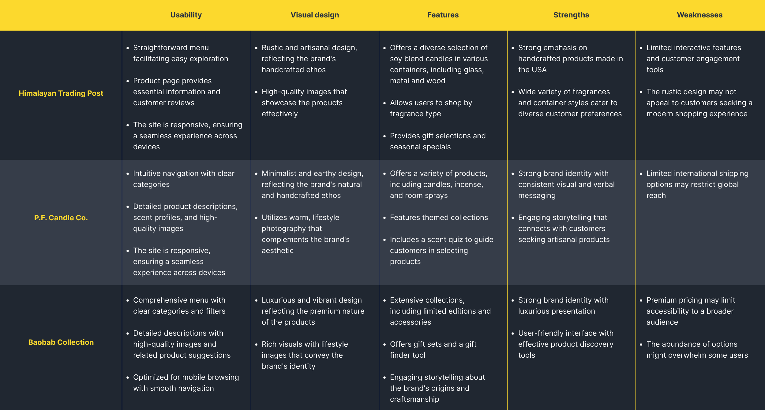
Key takeaways:
Emphasize Craft & Story: P.F. Candle Co. and Himalayan Trading Post both highlight the power of storytelling and authenticity, something Carhart Heritage Farms can build on.
Balance Visuals & Functionality: Baobab’s visual drama elevates brand perception, but accessibility and warmth, as seen in P.F., are key for relatability.
Opportunity for Differentiation: Carhart Heritage Farms has a strong opportunity to stand out by combining a nature-inspired aesthetic with a personal, small-batch narrative. In particular, the brand’s distinctive candle designs (shaped like desserts, plants, and botanicals) add a playful and artistic layer that none of the analyzed competitors offer. This handcrafted sculptural quality not only elevates visual uniqueness but also taps into the growing market for giftable, Instagram-friendly home products.
User empathy
Empathy map
To better understand the mindset and motivations of Carhart Heritage Farms’ target audience, I created an empathy map based on customer reviews, behavior patterns, and typical use cases. This tool helped distill key insights about what users say, think, do, and feel when interacting with the brand, particularly in the context of gift-giving, aesthetics, and supporting small-batch artisanship.
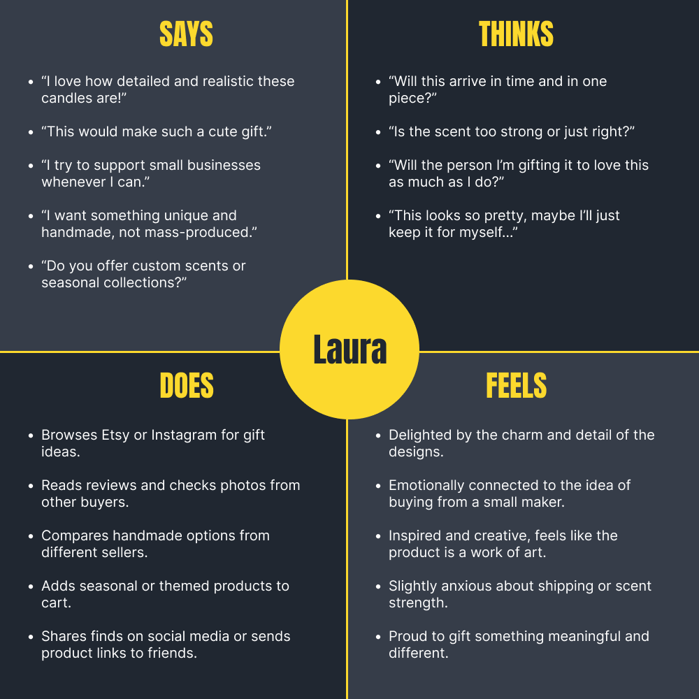
The empathy map reveals that Carhart Heritage Farms typical customer is highly driven by emotional connection, aesthetic appeal, and giftability. They value handcrafted, unique products and are especially drawn to the visual novelty of the candle designs. However, they may experience mild hesitation around scent strength and delivery reliability. To meet their needs, the website should emphasize product uniqueness, artisan quality, and trust-building elements like reviews, secure shipping info, and clear scent descriptions, while leaning into the giftable and seasonal aspects that evoke excitement and joy.
Desing process
The research phase revealed that users are drawn to Carhart Heritage Farms for its uniqueness, handmade charm, and giftable appeal. Insights from customer reviews and competitor analysis highlighted a strong emotional connection to the brand’s artisan story and visually delightful candles.
With this in mind, the website design focused on three key areas:
Showcasing the product uniqueness through immersive imagery and intentional layout.
Creating a warm and trustworthy user experience that mirrors the personal, small-business feel.
Optimizing for gift-giving behavior by highlighting seasonal collections, product detail clarity, and smooth purchase flows.
The result is a digital experience that feels handcrafted, joyful, and thoughtful, just like the candles themselves.
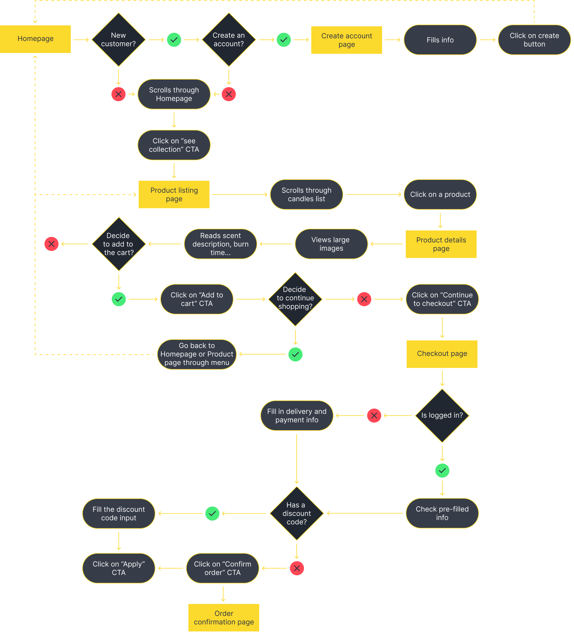
User flow interaction
To map out the most essential interaction on the site (purchasing a candle as a gift), I created a user flow diagram that outlines each key step in the journey. This visual representation highlights how users move through the site, and consider how tasks are connected throughout the ordering process.
Early wireframes
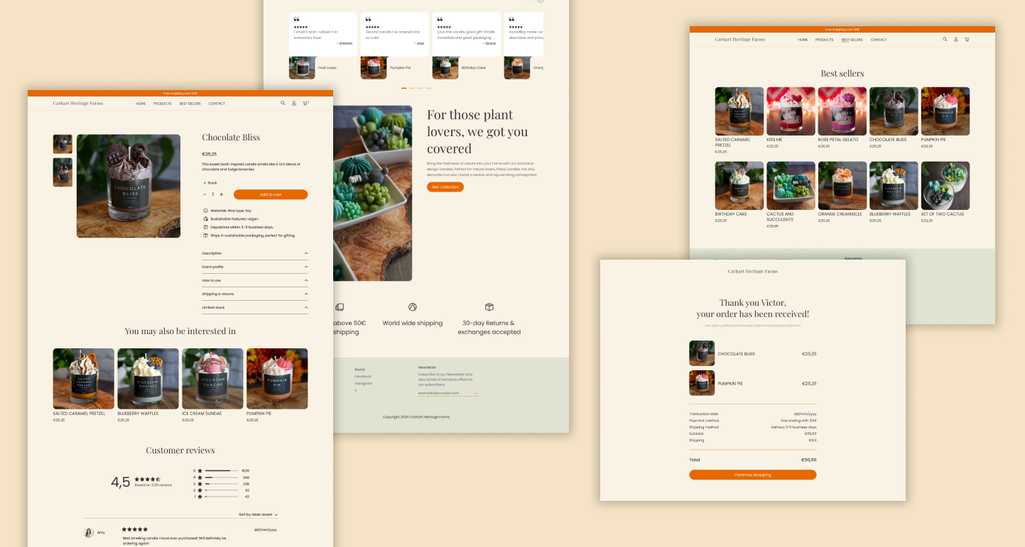
Before jumping into high-fidelity designs, I sketched out a few quick wireframes to explore the site’s structure and content hierarchy. This step helped me define how key sections like the homepage, product listings, and product detail pages would work together, from showcasing best-sellers to highlighting seasonal promotions and making the checkout flow intuitive.
These early drawings were essential to spot potential friction points and start shaping a user-friendly experience, even before touching the screen.

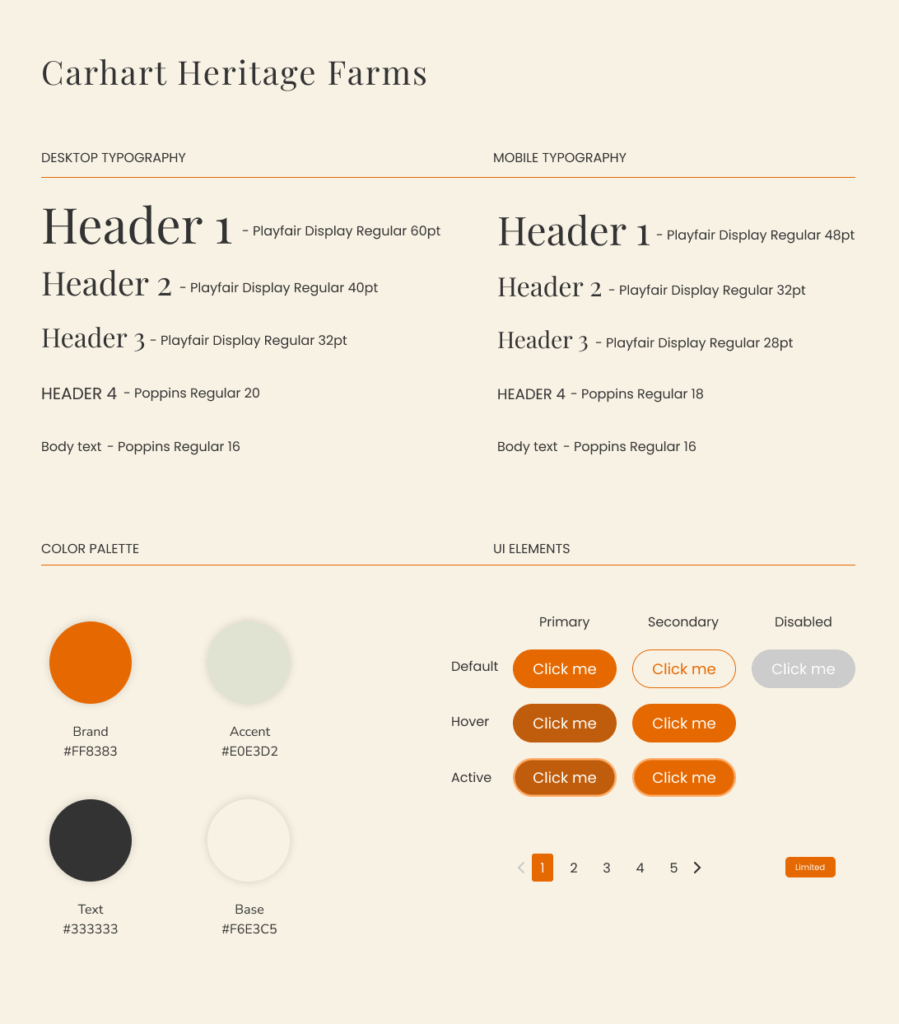
Visual language
The visual identity of the website was carefully crafted to reflect Carhart Heritage Farms’ handmade, nature-inspired essence. Drawing from the brand’s Colorado roots and the organic materials used in their candles, the design system embraces earthy tones, soft textures, and a warm, calming aesthetic.
Typography and layout decisions were made to balance rustic charm with modern usability, while large, editorial-style photography puts the product’s unique craftsmanship front and center. Seasonal accent colors, like the pink tones used for the Valentine’s collection, bring flexibility and personality to the interface, allowing the brand to adapt visually to different campaigns while staying consistent with its core look and feel.
Color palette:
The color palette centers around warm, earthy tones that evoke nature, craft, and comfort—reinforcing the handmade, small-batch feel of the brand.
Primary colors include muted browns, creams, and soft terracotta shades.
Accents vary seasonally (e.g. a delicate rose pink for Valentine’s), offering visual flexibility while maintaining harmony with the core palette.
These tones ensure the product remains the visual hero and the interface feels calming and grounded.
Typography:
Typography choices combine elegance and approachability:
Headlines use a serif typeface that adds personality and evokes tradition and craftsmanship.
Body text uses a clean sans-serif for clarity and readability across devices.
The combination reflects both the brand’s artisanal roots and its modern e-commerce functionality.
Components & UI patterns
The interface elements are designed to be simple, tactile, and consistent:
Buttons have soft rounded edges and high contrast to ensure accessibility while maintaining a handcrafted feel.
Cards are image-forward, with minimal text to let product visuals shine.
Inputs and forms are styled cleanly, with generous padding to enhance comfort during checkout.
Seasonal banners use color blocks and bold typography to highlight time-sensitive promotions or collections.
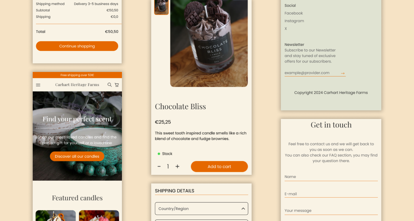
Responsive design
Given the significant percentage of users who shop from their mobile devices, it was essential to ensure the Carhart Heritage Farms website delivers a smooth and intuitive experience on smaller screens. The mobile design preserves all key functionalities—from product discovery to checkout—while optimizing visual hierarchy, readability, and touch-friendly interactions.
The layout adapts gracefully to the vertical format, showcasing high-quality product imagery, clear call-to-actions, and simplified navigation. Particular attention was given to streamlining the checkout process, maintaining transparency with order details, and offering quick access to express payment methods like PayPal and Google Pay.
User test & iterate
To validate the effectiveness of the design, a round of usability testing was conducted with participants representing the target audience. The test was carried out remotely using a clickable prototype on both desktop and mobile views.
Key Findings
Positive reception of product visuals: Users consistently praised the high-quality imagery, noting it helped them better understand the scent and theme of each candle.
Smooth navigation: Participants found the site intuitive, especially appreciating the consistent structure and filtering options.
Checkout clarity: While the checkout process was mostly clear, two users initially overlooked the “Apply” button for discount codes, suggesting its visibility could be improved slightly.
Improvements Implemented
Enhanced button contrast and spacing in the checkout form to increase visibility of key actions.
Simplified the mobile navigation menu to reduce cognitive load on smaller screens.
Through iterative improvements based on real user input, the experience was refined to better support user needs and expectations.
What’s next?
The next steps focus on continuous improvement and business growth. Future plans include:
Implementing a loyalty program to reward returning customers and strengthen brand engagement.
Introducing a blog to share candle care tips, behind-the-scenes content, and seasonal inspiration, enhancing both SEO and community engagement.
By continuing to evolve the platform based on user feedback and business needs, Carhart Heritage Farms can deepen customer relationships and build a stronger online presence.
Results and learnings
What went well
Users found the site easy to navigate and appreciated the clean, calming layout.
The unique product designs (dessert-shaped candles? Yes, please) really stood out and helped position the brand in a playful yet premium space.
Early feedback showed that customers were engaging more with the site and felt more connected to the story behind each candle.
The mobile experience turned out to be a strong point, confirming that putting extra thought into responsive design was worth it.
What I learned
People love products with personality, and the design should celebrate that, not tone it down.
Even small UI details, like microinteractions or seasonal color accents, can make the shopping experience feel more joyful and intentional.
There’s real value in giving users more than just a product, storytelling, care tips, and behind-the-scenes content help build trust and a sense of connection.
This project reinforced the idea that good design isn’t about flashy features or complicated flows, it’s about empathy, clarity, and creating something that feels just right for both the brand and its audience.